
The Human Advantage
The Awake brand system.
The single source of truth for how Awake looks, sounds and behaves — the engineered visual system for a Human Performance company built for senior corporate leaders.
How to use this guide
This is the operating system for the Awake brand. It exists so that every asset, conversation and campaign reads as one confident, evidence-led voice. When there is ambiguity about language, colour or layout, this document decides.
Find what you need
The guide is organised by element — strategy, voice, logo, colour, type, imagery — so you can jump straight to the rule you're checking.
Know what's fixed
Category, descriptor, promise, offer names and outcome words are locked — no synonyms. Layout and imagery flex within the system.
Everywhere
Website, decks, proposals and social all draw from these tokens. The live website is the reference implementation for spacing and motion.
New language or new visual treatments require sign-off. If it is not in this guide, it does not ship.
Brand strategy
Awake operates in the category of Human Performance. Everything below reinforces that placement and protects it from drift into wellbeing, coaching or personal development.
The strategic hierarchy — locked
| Brand | Awake |
| Category | Human Performance |
| Descriptor | Awake builds human performance capability |
| Marketing line | The Human Advantage |
| Commercial promise | Performance without burnout |
| Core business truth | Most organisations do not have a strategy problem. They have a human capacity problem. |
| Buyer | Senior corporate leaders and executive teams |
| Proof | 1,500+ responses showing measurable shifts in centred, confident, connected |
The plan is clear. The pressure is real. What is missing is the human capacity to keep performing under load. The gap between how capable senior people look and how depleted they quietly feel is the real constraint on strategy. Awake closes that gap.
Senior corporate leaders and executive teams carrying real commercial pressure — C-suite, CEOs and founders, CPOs and senior HR. Buyers commissioning capability, not comfort. We are not a wellbeing provider.
Truths we stand for
- Human performance is a capability, not a personality trait.
- Sustainable performance is a commercial issue, not a soft issue.
- Seniority increases exposure, not protection.
- The strongest people in the room are often the ones running the lowest.
- Growth should not cost people their health, their relationships, or themselves.
The four capacities
Capability development is built on four capacities. These drive greater human capacity, which drives sustainable performance and the success-code outcomes.
Know Yourself
The self-awareness that underpins every other capability — to regulate, decide and influence.
Lead Yourself
The internal leadership required before external leadership is credible. Standards and accountability.
Trust Yourself
Grounded confidence from evidence, not ego — holding position under pressure without becoming brittle.
Sustain Yourself
The practices that make high performance repeatable rather than seasonal.
Tone of voice
Direct, grounded, commercial, simple. We speak plainly, like a real person — evidence-led and confident. No jargon, no hype, no spiritual drift.
We are
- Direct and grounded
- Commercial and evidence-led
- Economical — impact counts
- Human — we speak plainly
- Confident, never hype
We aren't
- Vague, airy or spiritual
- Preachy or motivational
- Padded or wordy
- Buried in buzzwords
- Trying too hard
Quick test before publishing: can you cut words and keep the meaning? If yes, cut them. Does it sound like a real person talking? If not, rewrite it.
The success code
The master outcome language. Every offer, keynote and proposal connects to these three words. We do not substitute them for softer synonyms.
The physiological and psychological capacity to perform without depletion.
The internal drive that sustains effort, standards and ambition over time.
The relational depth that holds teams, cultures and leaders together under load.
Proof language (centred, confident, connected) is distinct from the success code. It is drawn from the evidence base and used where measurement is referenced — it sits alongside energy, motivation and connection, never in place of them.
Messaging spine
The sanctioned lines for decks, proposals, website, content and sales. Use them consistently.
- The Human Advantage.
- Awake builds human performance capability.
- Performance without burnout.
- Most organisations do not have a strategy problem. They have a human capacity problem.
- The constraint on your strategy is the capacity of your people.
- Human performance is the commercial edge.
- Measurable shifts in centred, confident, connected — across 1,500+ responses.
Language we avoid
If a piece of copy could sit comfortably on a generic wellbeing provider's website, it is wrong for Awake. Rule for proof: use the number, then the three words, in that order.
Logo
The AWAKE wordmark ascends upward — progress and growth. In the performance system we use the primary wordmark only, in a single flat colour, at maximum contrast. No tagline lock-up.
Primary wordmark
White — on dark Ink — on light
Clear space & minimum size
Keep clear space on all sides equal to the cap-height of the “A”. Minimum digital width 90px; minimum print width 24mm. When in doubt, give it more room.
Misuse — never do this
Colour
A dark, engineered palette. Ember is the single, rare signal. Copper is the structural secondary accent. Everything else is dark neutral and warm bone. Backgrounds are solid — never gradients (the photographic key-light is the only exception). Click any swatch to copy its hex.
Core palette
The ratio — 60 / 30 / 10
Ember is earned — it appears only on CTAs, rising data, the trace and dot, and as the photographic key-light. Never ember for body text or large fills. Copper carries structure: section & index numbers and the “before” state in data. On light surfaces copper is unreadable — use deep-copper #9E4E12 instead.
Accessibility — contrast (WCAG 2.2)
| Pairing | Ratio | Verdict |
|---|---|---|
| Bone #F4F0E9 on Obsidian #0A0C0F | ~18:1 | AAA — body & headings |
| Copper #ED9251 on Obsidian | ~8:1 | AA/AAA — labels on dark |
| Ember #E85D2A on Obsidian | ~4.8:1 | AA — large text & accents |
| Ember on Bone #F4F0E9 | ~3.6:1 | Large / UI only — not body |
| Deep-copper #9E4E12 on Bone | ~5:1 | AA — labels on light |
| Copper #ED9251 on Bone | ~2.1:1 | Fails — use deep-copper |
Typography
Three typefaces carry the system: Ryker for display, Inter for body, IBM Plex Mono for every number, label and data annotation.
Awake builds human performance capability. We equip senior leaders and their teams with the capability to perform at a high level, sustainably, with energy, connection and motivation — from the inside out, so it becomes a business metric.
Type scale & hierarchy
| Display / H1 | Awake builds human performance |
| Heading / H2 | Measured, not claimed |
| Subhead | Performance without burnout, at senior levels. |
| Body | Grounded, commercial copy in Inter Light or Regular at 16–18px. |
| Kicker / label | THE HUMAN ADVANTAGE |
| Big number | 91% |
Let one Ryker headline dominate; pair it with calm Inter body and mono labels. Web fallbacks: Archivo Expanded for display, system UI sans for body.
The Signal Trace
The one ownable device: a line that rises left → right, tipped with the ember dot. It is Awake's real before → after data (pooled 61 → 91) rendered as identity.
Rules: the trace rises and is drawn in ember only. It stroke-draws left → right on scroll (~1.1s), then the dot lands — disciplined, never bouncy. Respect reduced-motion (render the final state). Scales from full-bleed hero line → divider → micro-trace behind a number → the standalone locator dot.
Photography
A duotone treatment unifies a mixed library into one engineered system: cool ink monochrome, a single rare ember key-light, and a legibility scrim. Every long dark stretch is broken by a real human face — the human counterweight.
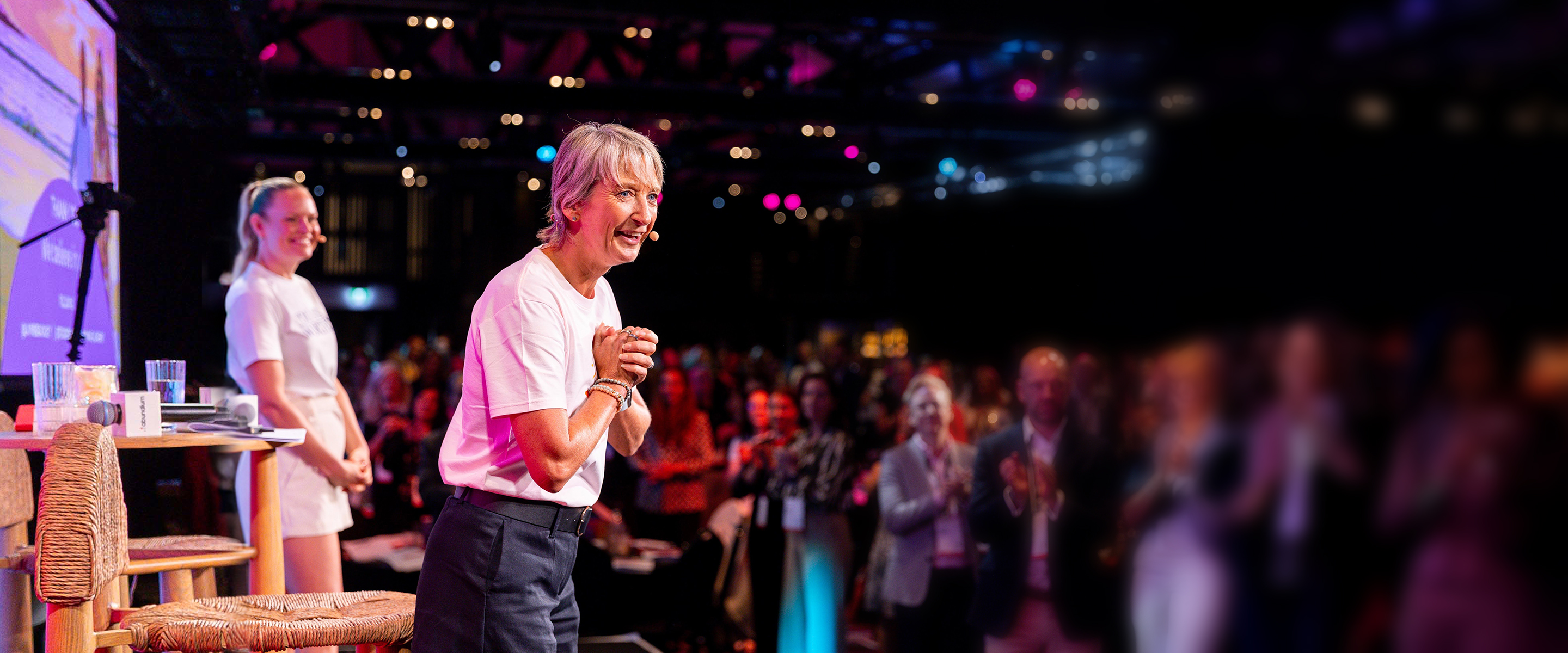 Stage · lighter treatment
 Founders · duotone
 Participants · duotone
key-light: radial-gradient(60% 55% at 72% 32%, rgba(232,93,42,.20), transparent 60%); mix-blend-mode: screen;
stage / cinematic: grayscale(.42) contrast(1.05) brightness(.82) /* keep the stage light */
Do
- Treat every image with the duotone recipe
- Keep real, candid human faces
- Use the ember key-light sparingly, once per image
- Darken with a scrim so text stays legible
Don't
- Leave bright, saturated consumer photography untreated
- Use ember as a heavy colour wash
- Stack multiple key-lights or gradients
- Let long dark stretches run without a face
Legacy imagery is treated to bridge into the system; an executive-context reshoot is the recommended fast-follow.
Layout & applications
Dark-first, generous negative space, solid fields, and a fine hairline grid. Ryker headlines lead; mono labels and numbers anchor the evidence. One architecture across every surface.
Dark-first
Obsidian and ink fields carry the system; bone is the counterweight for light moments.
Earned accent
Ember for the signal, copper for structure. Solid backgrounds only — no gradient fills.
Evidence forward
Numbers are set in mono and treated as the hero. Use the number, then the three words.
The system in use
Accessibility
Accessible by default. The system is built to meet WCAG 2.2 AA so the brand is legible and usable for everyone.
Bone-on-obsidian and ink-on-bone pass AA/AAA. Ember and bright copper are reserved for large text, accents and UI — never small body copy on their weak pairings. See the contrast table in §07.
All animation honours prefers-reduced-motion — the Signal Trace and reveals render their final state with no movement. Motion is never essential to meaning.
Semantic landmarks, one H1 per page, logical heading order, meaningful alt text on photography, and decorative SVGs hidden from assistive tech.
Visible focus states in ember, keyboard-operable navigation, and tap targets of at least 44px. Content is readable with JavaScript disabled.
Evidence & proof
Awake is measured, not claimed. Proof is specific and always framed the same way: use the number, then the three words, in that order.
Before → after (pooled, seven cohorts): centred 61 → 91, confident 69 → 91, connected 73 → 91. Source: The Performance Paradox, Awake research white paper, 2026. Outcomes are tracked, not claimed.
Governance & downloads
This guide is the north star. New language or visual treatments require sign-off before they ship. Keep it current — it evolves with the brand.
Brand & marketing owns and approves changes to this system. Escalate ambiguity here before creating new assets. Partners and vendors must work from this guide.
Version 1.0 · 2026. Record the version and date on every update. The live website remains the reference implementation for spacing and motion.
Downloads
Inter and IBM Plex Mono are free (Google Fonts). Photography lives in the shared drive media library. For questions, contact the Awake brand team.